Monday 25 February 2013

London Fashion Weekend!


I feel like a zombie at the moment, had only about 5 or less hours of sleep last night and I have no energy whatsoever.. I want to go to sleep so badly but then I thought it's better to get this post done before it gets a bit out of date. So here it goes....

Before the half term I had a very hectic month; portfolios, uni apps, interviews, projects, etc etc. I did 2 interviews, one was at Kingston and the other was at Ravensbourne. I got an offer from Kingston which I'm overwhelmed about, and I am still waiting to hear from the other unis. By the way it is NO FUN at all to carry a huge, very heavy portfolio around London, I had sore arms for a couple of days. Oh and I've learnt that if you're waiting in a canteen or a room for your turn to 'shine' and your surrounded by other applicants, talk to them! If you're lucky you can meet some lovely people and it makes you feel  a little less nervous. So after all the hassling I said to myself...Jenny you deserve to have a break, just relax for a few days it won't do any harm, then whooosh it is the Sunday before college starts already. It's strange how time flies quicker when you're having a good time and it goes slower when you're not. I had a great half term if you ask me, I was having enough sleep, didn't need to worry about a thing, and the best bit was that I won 2 tickets to the London Fashion Weekend!!! Well, I bought them for 45 quid on ebay, not bad eh!? :D

So on the 23rd Feb, 2013 Saturday, me and my pal Daniella went to Somerset House with heaps of excitement to watch Issa London's S/S 2013 Collection show. Daniella Helayel the Creative Director of Issa London, who is born and raised in Brazil. The collection was inspired by the vibrant and exotic atmosphere of Brazil.


the pics I took were either too bright or too blurry :/

London Fashion Week   Spring/Summer 2013   Print Trend Highlights   Part 2 catwalks
I absolutely love the collection, the prints were mesmerizing with vivid colour combinations and beautiful fabrics. It felt like the collection was made for me because I'm a sucker for animal/crazy prints. The silhouettes were elegant, the models were looking glamorous with their snake scale like heels and pretty embroidered flower head pieces with some golden statement jewelries. What I liked about the collection was how it was put together, Daniella (the designer) pick different range of styles like some were simple wrap dresses whereas some dresses had busy prints, there was a well-balance between the colours and prints and it wasn't OTT. It definitely captures the relaxing vibe of a summer vacation by a beach.

After the show, we went to the shop & lot bit which was pretty awesome. I found some cool shades and I couldn't resist to try them on... I bought some bracelets and they were pretty much the only items that I could afford to get....sad times, though we picked up every business cards that were displayed from each stand.
I love these mickey mouse ones

It was slightly uncomfortable
We got goodie bags which wasn't as exciting as i thought it would be like.

Sunday 24 February 2013

booking a charity by elli

 So its been a long time coming but my previous project, and first proper project under our specialism was "booking a charity". In which we had to choose an object from a charity shop and create a book as a final outcome. I chose an old fashion Kodak film canister as I thought it could lead to some good opportunities in terms of imagery and pathways. Below are my five favourite sketch book pages, I was also very pleased with my final outcome as it looked more or less exactly how I pictured to it. To make my book I developed a proposal in which the Kodak film canister was used as a vessel to transport images to my 'company' that I would then turn these images into a beautiful one of a kind book.

Thursday 21 February 2013

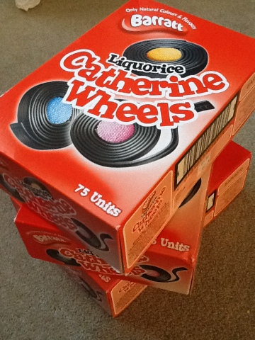
Best Parcel EVER!!!

After the crit before half term I realised how many Catherine wheels I was going to need for my skirt!! S I emailed the company who makes them not really even expecting them to reply

But then the best parcel arrived the other day and all they want in return is some photographs!!! So I now have 225 Catherine wheels to play with!!!


Tuesday 19 February 2013

CHLOE- HELPED OUT AT MARK FAST'S LFW SHOW


HELPING OUT AT MARK FAST'S LFW CATWALK SHOW


On Saturday at  9pm I emailed Mark Fast's assistant reminding him I was free and willing to help during the London Fashion Week show which I was sure wasn't going to get read, but received a speedy reply 10 minutes later saying to meet him at 1pm opposite Somerset House in the ME hotel reception the next day. We were given a LFW backstage wristband so we wouldn't get questioned throughout the day and then taken to floor 8 of the 5*  hotel.
                             
(ME Hotel London)


For the first half hour me and the other 3 interns sat and watched endless amounts of people cram into the 4 hotel rooms and corridor that they had booked setting up the hair, make-up, clothing and refreshments stations in each room. The models started arriving and began the process of getting ready, we were instructed to help the models get into their dresses. The dresses were beautiful, with an orange, red and fuscia colour palette, the knitwear collection had some sculptured cape pieces and also some tight fitted fringed dresses, they were elegant as always and had a sexy edge to them making them questionably wearable but still extremely beautiful, each model had a red stripe in their slick back ponytails which matched the vibrant colour palette. Handling the designer clothing was such a bonus as the quality of his work is incredible, you can see the effort that goes into the precision detailing on each garment.

Next I was sent downstairs with Fast's assistant to stand outside and find the model whom was now running 2 hours late, it was freezing cold and she still hadn't turned up so Richard sent me inside with the guest list to stand by the lifts and tell the first arrivals that they were running (ALOT) behind. The model turned up 10 minutes before the show was meant to start as she had been in Vivienne Westwood's Red Label catwalk show and been held up through that, me and the other intern were told to calm the 200 guests waiting impatiently outside the lift doors whilst the model was sprinted to get ready. There was a lot of angry photographers and editors of magazines demanding we let them upstairs, where on the top floor of the hotel they had transformed the former restaurant into a catwalk.
After we let everyone up the lifts and they were seated we were told we could ourselves sneak into the show and stand at the back and watch!!


(My own photos of the show and view from the roof terrace)

There were two shows (3.30pm and 4.30pm), the most popular was the later one in the day; as we were escorting the guests up the lifts I met a few famous faces, first being Pixie Lott wearing a lush fur collar and then Delilah and Zara Martin who arrived together looking extremely elegant.


I loved the shows as the venue was quite small but very bright, the models walked very close to the audience and so you got to really get a feel of the extravagant dresses. There were 10 looks and 10 models all together but these four were my definite favourites. In the background of the top and bottom images you can even see me standing to the left of the models taking some pictures!


The day was totally unexpected and last minute for me but it was so lively and such a great opportunity to work backstage with Mark Fast's team, he is such a great knitwear designer and am so thankful that I got to experience the magic behind the LFW show!

I am going to be keeping my backstage wristband on for a long time.. here's a youtube link to the show!
Although the music is rather strange that they have put over the top, the actual music started off with Little Dragon - Ritual Union, which was very upbeat and I really enjoyed!

Thursday 14 February 2013

Purple moodboard by Sian :)

Okay so this one is just an artist response to a picture that I found on tumblr really but I thought it was quite cool!

And then this one is my final moodboard, all stuck down and everything. It took forever and lots and lots of superglue (involving me accidentally sticking my hand to the table...) and lots and lots of double sided. I like things being really busy, not that you'll be able to tell or anything!

Tuesday 12 February 2013

Black Illustrations

Haven't blogged in a little while so now that they are finished I thought I would post my 5 fashion illustrations....


Now I just need to choose which one to make!!

Hope everyone had lots of pancakes :0P

Lauren x


Monday 11 February 2013

CHARITY STYLING - CHLOE


SKETCHBOOK PAGES


Just a couple of pages from the 'Charity Styling' project, I chose a small rocking horse ornament as my starting point and over the three weeks explored styling and marketing around a product/ fashion brand which I developed from the rocking horse theme. In the end I came up with "Restoration" as the fashion brand and made posters and invitations (as seen above) to a fashion show I would hold for the "Spring '13 collection". I made bunting (sample bunting in Image 2 ABOVE) from the combination of a repeated pattern of my rocking horse and a background clothing pattern from Louis Vuitton's Spring '12 catwalk show based on carousel's (below). 


After making the bunting I wanted to create a set of images with a model marketing "Restoration", I  wrapped the bunting and lots of fairy lights around my model (Livi) and scattered the advertising posters and repeated patterns (below) on the floor and stuck them on the walls of the studio. I chose my model an outfit that fitted to the purple and green colour scheme and also that had a circus themed pattern on the playsuit.


Here are some of the final images which I edited using www.befunky.com, I am really happy with the lighting and overall effect to the compositions! I love the glowing shadows behind her which are created from a soft box directed from the left hand side and also the fairy lights which are wrapped around her body. I want to use the images to create a magazine spread of the "Restoration" brand as it would be seen advertised in a magazine for a current collection.


-PROJECT COMPLETE-

Thursday 7 February 2013

EJ and the colour purple

 Ok so, Hello.

I am back to blogging as I've finally been able to log in, yaaaay! Gayle you should feel slightly relieved ;) My colour is purple- A colour I dislike strongly but I can easily adapt and I do like a challenge.
   I am a big fan of textiles however I'm looking forward to express my inner love for fashions and collections. Its really exciting being able to use my Elle and Vogue knowledge into more depth. The change from interiors is healthy.

 So after our 1minute presentations today on our selected designer and skirt/dress, I thought I should upload my sketchbook research I've just done!

I really felt inspired by Christopher Kane's collection, its sweet coated pastels and rebellious use of DIY alternatives in contrast to buttons was cleverly produced as well as the link to Frankenstein (using polyester tape too.) Some of his pencil dresses were very minimal and chic- a dress that many women lust for and Christopher Kane is the designer to produce just that. Although looking deeper into his designs the dress I chose had layers of lace and embroidery with harsh uses of tape which  were shiny and eye catching. I really like the tape however I feel it could possibly be sewn into slightly to become more apart of the dress as it slightly looks "shoved" on. On the catwalk the dresses all varied in structure on the silhouettes and it feels like  a rather romantic, sweet, setting however it wasn't too endangered by being overly girly as the inspiration of Frankenstein was incorporated into with printed t-shirts. On the other hand the embroidery and embellishment is beautiful, it seems pure with the pastel colour scheme and the variation in skirts is most certainly noticed. I usually go for print when seeking inspiration but I just love Christopher Kane so much, I had to choose him.

Here is a sketchbook page, I did an hour ago...
Also little pictures of the mood boards I created on Wednesday :)


I'm currently really inspired by a cheeky little red cabbage for this project but we'll see hmm.

P.s here is my styling photography from our last project... Better late than never!


Tuesday 5 February 2013

Wabi Sabi - by Lauren

Wabi Sabi is the ability to see “beauty in imperfection” and appreciate something that isn’t quite finished, crooked or random also known as a “haphazard beauty”. It means replacing elaborate decoration and designer products with something much more rustic and simple and keeping spaces open, clutter free and not overdoing it with pattern and decoration and learning to appreciate a bit of wear and tear. It is being able to ignore brands and labels and appreciate beauty from a different angle. It is being prepared to accept beauty in simple things and accepting the age and history of an item and where imperfections have come from. Although wabi sabi can be seen best in a clear space as this enables you to enjoy the true beauty and not become distracted by clutter. Wabi sabi is also used in Japanese interior design however they are traditionally very dimly lit and shadowed and contain no bright colours instead a carefully selected palette of greys, browns, black and greens are used to create a “womblike” atmosphere, they contain many materials that are prone to decay and ageing so that the room ages and changes over time and in the wabi sabi spirit becomes more beautiful. Although wabi sabi is a Japanese tradition I think that it is something that should be embraced by all. Vintage and second hand should be in every home as a bit of natural ageing and wear and tear adds charm and character to an object. However there is no reason not to take the object and add to its beautly with a personal touch and a bit of up-cycling. I think that wabi sabi is something that everyone should consider when thinking about replacing something as a lot of the time there is nothing wrong with the original object especially with the current trend of vintage and second hand becoming more and more popular.
here are my wabi sabi photos....